Choropleth maps use different colors and shading to depict statistical values if particular areas. This map shows the percentage of the population that is 50 years or older. In 1990 only 0-10% was over 50, it is predicted that by 2030 10-30% of people will be over 50 years old. The scale in the middle shows the percentage range and the correlating colors that will be be seen on the map.
info:
http://www.eps.mq.edu.au/courses/GEOS219/choropleth.htm
Tuesday, January 26, 2010
#6: Dot Distribution Maps
This map is from the U.S. Census Bureau, it represents the population in the United States in 2000 using dot distribution. While you can't tell a specific amount of people you can understand the ratio of were people live most. Each dot represents 7500 people, so the brightest areas have the greatest population.
Info from:
http://www.census.gov/geo/www/mapGallery/2kpopden.html
#5: Cadastral Map
A Cadastral map is used to show legal property boundaries, it represents relative positions and dimensions of land and can also show streets and other features in the area. This map is of the Olmstead Park in 1909, the area is now a neighborhood in the Alameda District in Northeast Portland. The map shows sizes and shapes of each individual lot as well the streets, their names, and sizes.
Info from:
http://alamedahistory.org/the-map/
Info from:
http://alamedahistory.org/the-map/
Tuesday, January 19, 2010
#4: Flow Map
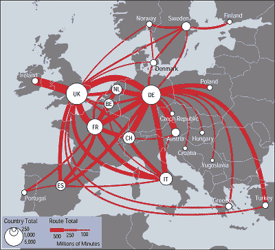
A Flow map can be used to display any type of movement, for example people in migration, goods through trade, and the spread of disease. This particular Flow map displays the traffic of telecommunications in certain countries of Europe. The scale in this type of map is very interesting, the thickness of the line from country to country is relative to the millions of minutes used during telecommunication between those places. The white circles represent the total annual outgoing traffic to other countries.
info from:
http://mundi.net/maps/maps_014/
info from:
http://mundi.net/maps/maps_014/
#3: Thematic Map
This is a Thematic map based on the population change in the United States from 1990-1996. It is thematic because it focuses on one common theme of the mapped area rather than many different land attributes. It uses a colored code to distinguish different percentage ranges of population increase.
Info from:
http://www.sou.edu/Geography/JONES/GEOG280/sample.htm
Monday, January 18, 2010
#2: Planimetric Map
This is a Planimetric from 1932 of a walled Chinese city and its irrigation system. The map was created by the Japanese Expeditionary forces in Shanghai. The Planimetric map focuses primarily on horizontal features of the shown area, in particular this map is descriptive of the city boundaries, water systems, lakes or ponds, roads, and what seems to be forest areas.
info obtained from:
http://www.loc.gov/rr/geogmap/guide/gmillgen.html
Tuesday, January 12, 2010
#1: Topographic Map
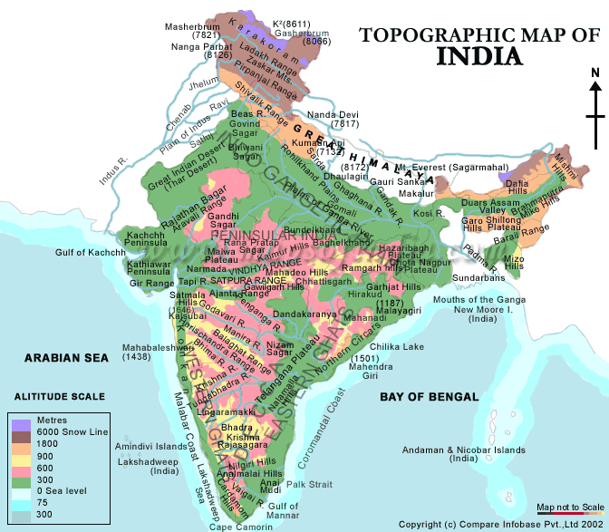
This topographic map of India displays the many regions as well as their altitudes. In addition to just showing land masses it also shows the surrounding bodies of water and their depths as well. The graph uses a colored key system to describe the different ares altitudes, each color is paired with a specific number of meters and anywhere that color exists so does the corresponding altitude. The map seems to focus mainly on general regions, it is not to scale therefore it does follow the correct latitude and longitude system.
information from:
http://www.mapsofindia.com/maps/india/topographic-map.htm
information from:
http://www.mapsofindia.com/maps/india/topographic-map.htm
Subscribe to:
Posts (Atom)